Resident has a deep knowledge of the specific challenges and opportunities presented by working within the airside environment, both in the UK and now internationally.
Working with a long-established network of contacts within the airports, and the cross-disciplinary creativity of our designers, consultants and contractors, Resident create outstanding airport lounges. With these foundations, Resident have now made a seamless transition into the F&B sector following their appointment by Pret A Manger to design a new flagship store in Heathrow Airport. From lounge dressing or shop design to navigating the logistics of the airside/landside protocols, Resident are experts at delivering new or refurbished airport lounges and retail units.
Pret A Manger
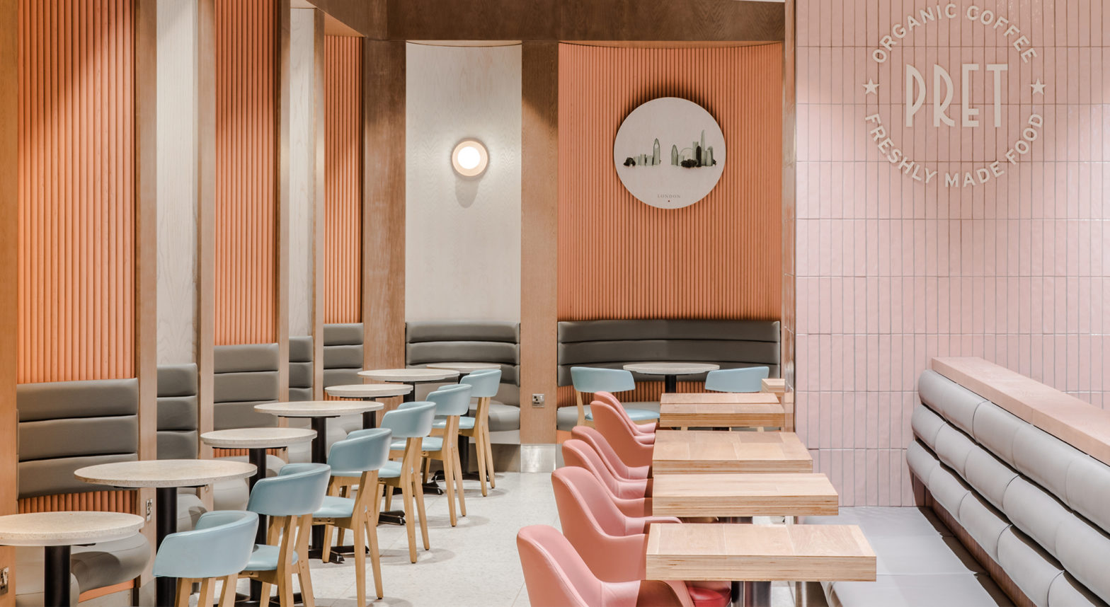
Resident were appointed by Pret A Manger to design their new airside flagship store in Heathrow Airport Terminal 2. Pret’s brief, alongside Heathrow’s retail design expectations called for a unique identity whilst maintaining the Pret brand. Branding is often solely associated with design, but there are other underlying factors that create the framework and canvas for the design. Resident worked closely with Pret’s project team to streamline this flagship operation to ensure customer flow and swift service can be maintained in this expanding, quick paced airport environment.
This premium space covering 24m of prime shop frontage has been opened up along its entire length, not only to cater for passenger flow but to provide full transparency, allowing the design to be read holistically. Pret’s brand name and colour forms a strong portal, flanked with digital displays at each end to showcase their offering. Within the store, Pret’s preferred timber specification is complimented with a revived, playful secondary colour palette and contemporary industrial sales court.
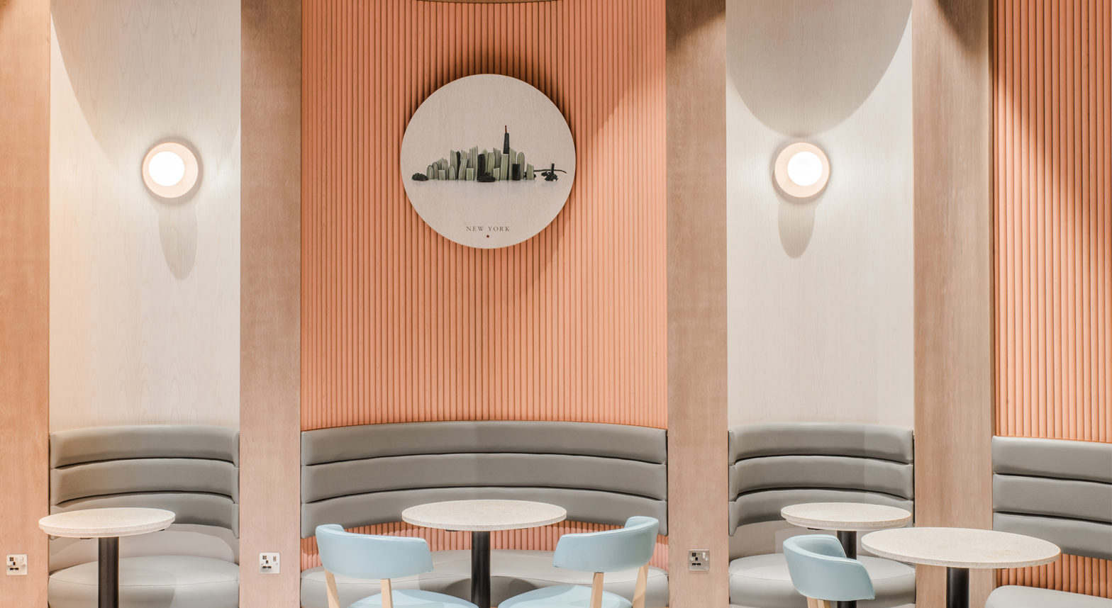
Resident developed a bespoke joinery feature piece at the heart of the shopfront to catch the eye, guide customer flow, display merchandise and provide seating. A dropped bulkhead towards the rear of the space leads you to comfort seating. Sinuous banquette seating washed in the revived colour palette lines the perimeter to provide more privacy to individuals and groups. Alternating banquettes display Pret’s passion graphics and the feature column a simple roundel to maintain the Pret identity in this new look space.
All these elements combine to create a flagship store that not only retains the identifiable Pret brand but carries a unique identity special to Heathrow T2 both in aesthetic and operation.
No1 Lounges Birmingham Airport Clubrooms
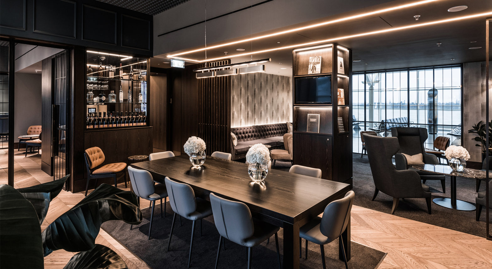
Resident worked closely with No1 Lounges in refreshing their premium Clubrooms brand. Key to this was understanding its existing identity; exclusive, luxurious, jet set, and how these values could be enhanced. We also focused on complimenting these with elements that would evoke atmosphere and sophistication and bring a classic modern feel to the space.
This lounge gave us a great opportunity to elevate the brand with its location in a lofty Departures Terminal. We formed a deep entrance portal to lead guests into a reception that would provide glimpses of the three main rooms. The reception corridor retains a modest ceiling level to ensure your sense of arrival to each room, where the space reveals its height and light.
The existing clubrooms material and colour palette was also scrutinised. The dark blue timber panels were deepened in tone and refined to simple elegant beading, whilst proportions were made slender to bring further elegance and modernity. The timber flooring selection was a tone warmer and lighter with a modern chevron finish. Crittall glazing and doors match the panelled proportions to maintain consistent datums across the elevation. Vertical timber screens were introduced to bring a further layer of exclusivity to seating areas.
The richness of the dark fumed oak was retained and enhanced with light bronze detailing and reeded glass to bring a further layer of tactility to the lounge. The ceiling design was muted in both colour and lighting, which had significant impact in creating a more intimate atmosphere the lounge was offering. Lighting was only where required, with uplighting and wall lights used to great effect. Luxurious light fittings, new punchy signature furniture pieces, warm toned dressings and carefully selected planting elevated the brand further.
The brand was developed with the user experience at the focus of the design process, and this exclusive lounge offers both sophistication and luxury, presenting a calm atmosphere amongst its setting and forming the benchmark for future Clubrooms.
No1 Lounge
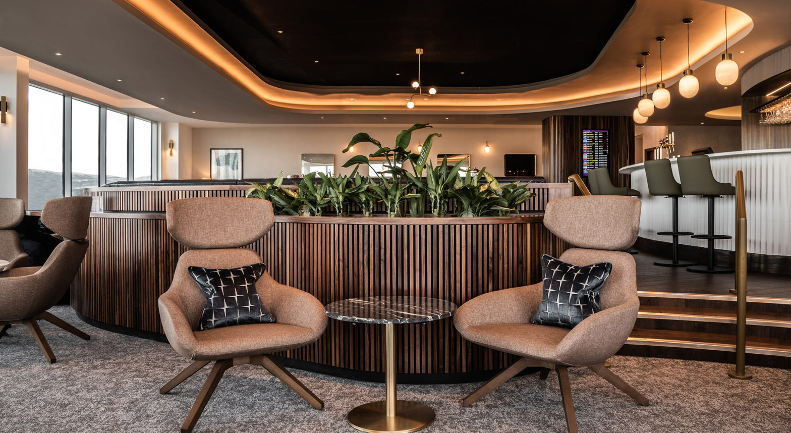
As part of Edinburgh Airport’s expansion plan, Resident’s previous lounge in Edinburgh was set to be relocated. This presented us with the opportunity to implement the brand refresh that our interior design team had been working on. The brief called for a jet age and eclectic feel, and the plan for phase one encompassed three key spaces; the bistro, bar and window lounge, with the sports bar and library to follow in phase two.
The No1 Lounge also captures the essence of mid-century design, an aesthetic that defined the romantic era of flying, offering travellers a refined and relaxed atmosphere. Resident worked closely with the Client in refreshing the No1 Lounge brand, with the palette of materials, patterns and furniture being chosen to reflect its new identity. Calcatta marble and rich walnut surfaces combine with warm brass highlights and three-dimensional tiles to create a functional yet crafted sense-of-place.
The colour palette was harmonised to create a bold scheme, with the addition of a few strong colours and materials. Textured walls coverings combine with mirror and brass finishes throughout the lounge to provide a consistent backdrop. Sinuous curves in the layout creates a soft and relaxed atmosphere throughout the lounge, with warm statement lighting and furnishings strengthening its mid-century modern identity.
My Lounge Gatwick Airport South Terminal
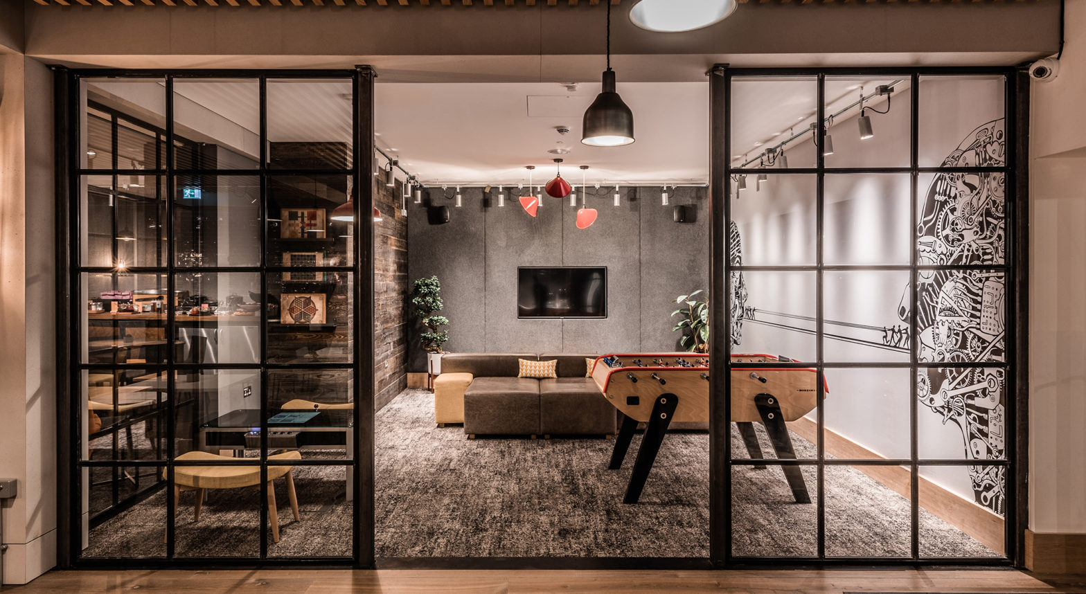
MyLounge embodies a vibrant, relaxed and social brand identity which creates an atmosphere reminiscent of home comforts so that anyone would feel welcome whatever their age. The existing My Lounge identity was reviewed by our team and refined urban character was highlighted as a key requirement to elevate this lounge the next level. Focus was given to roughening up the shell and core of the spaces, which would provide a strong contrast to the more colourful and playful furnishings. The addition of personal objects and items also aimed to make the spaces more ‘lived in’.
The colour palette was revised to include more hues of green and terracotta with punches of mustard and blues to increase the vibrancy. Carefully selected planting was also brought into this lounge to enhance the relaxed nature of the space. Glazed screens, bespoke steel shelving and light features divide spaces to create a varied range so visitors can choose the lounge experience that suits them. The relationships between the spaces of the games room, dens, TV lounge and dining room help define the character of the lounge; while the Scandinavian industrial design influence creates a sense of warmth and familiarity.
The finishing touches
We have been working to establish an Interior Design team within our practice. One which understands the demand of the Airside specifications. Our long-standing relationship with furniture suppliers and lighting designer have allowed us to develop brand identities that can be rolled out across airports both in the UK and overseas. One of the key challenges consistent through our brand refreshing was retaining the finishing touches and dressing of a lounge to really emphasise a brand.
So often a great deal of time is spent on lounge design only for the practicalities of operation and value engineering to dilute the final quality and outlook. Whilst it is critical to have the shell and core of the design in the right place from the outset, the finishing touches are where a brand can shine. From the selection of the right depth and material of artwork frame, to the bespoke design of a mirror or joinery furniture, these all play their part in bringing together the new identity of a lounge.
Bespoke joinery was designed first and foremost for the practicalities of lounge operation, with the consistency of finishes integrated to speak the language of the lounge. A beautiful seat, a tactile lamp and a beautiful art wall or joinery item maybe wonderful pieces on their own but combined they can set the scene for memorable lounge moment, a space of relaxation. Removing that beautiful leather finish, that attractive light feature or the warmth from the joinery, and the space or collective is less likely to hold the same resonance to the brand.
Working backwards with the budget, it must be worth considering what lighting, furnishings and dressings will refine and define a brand and ensure they are given the priority they need to not be cast first off the list.