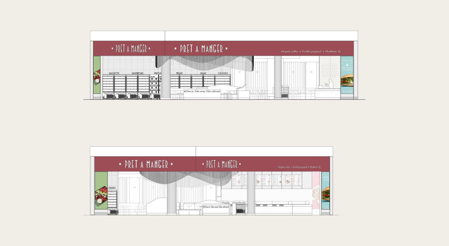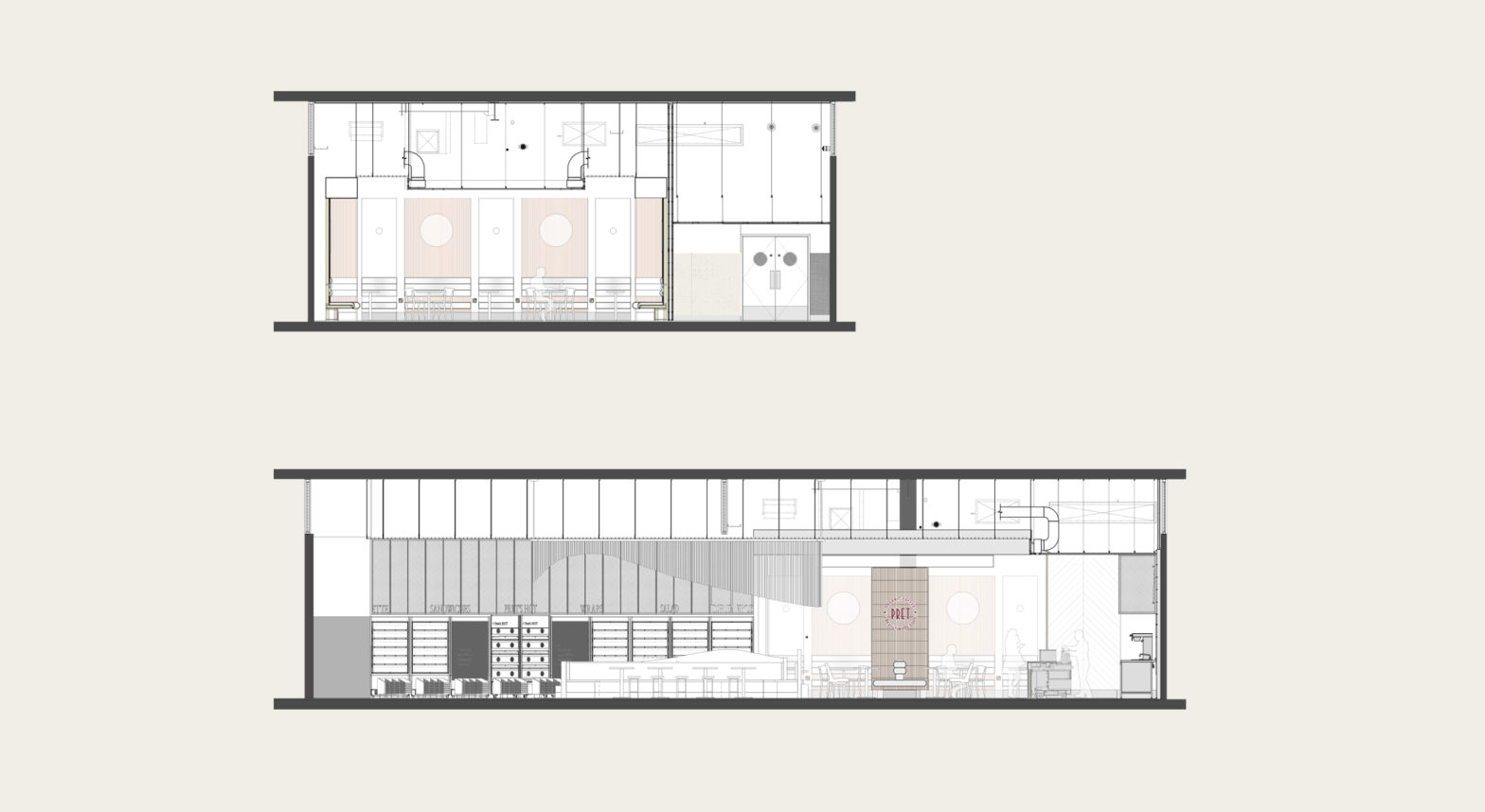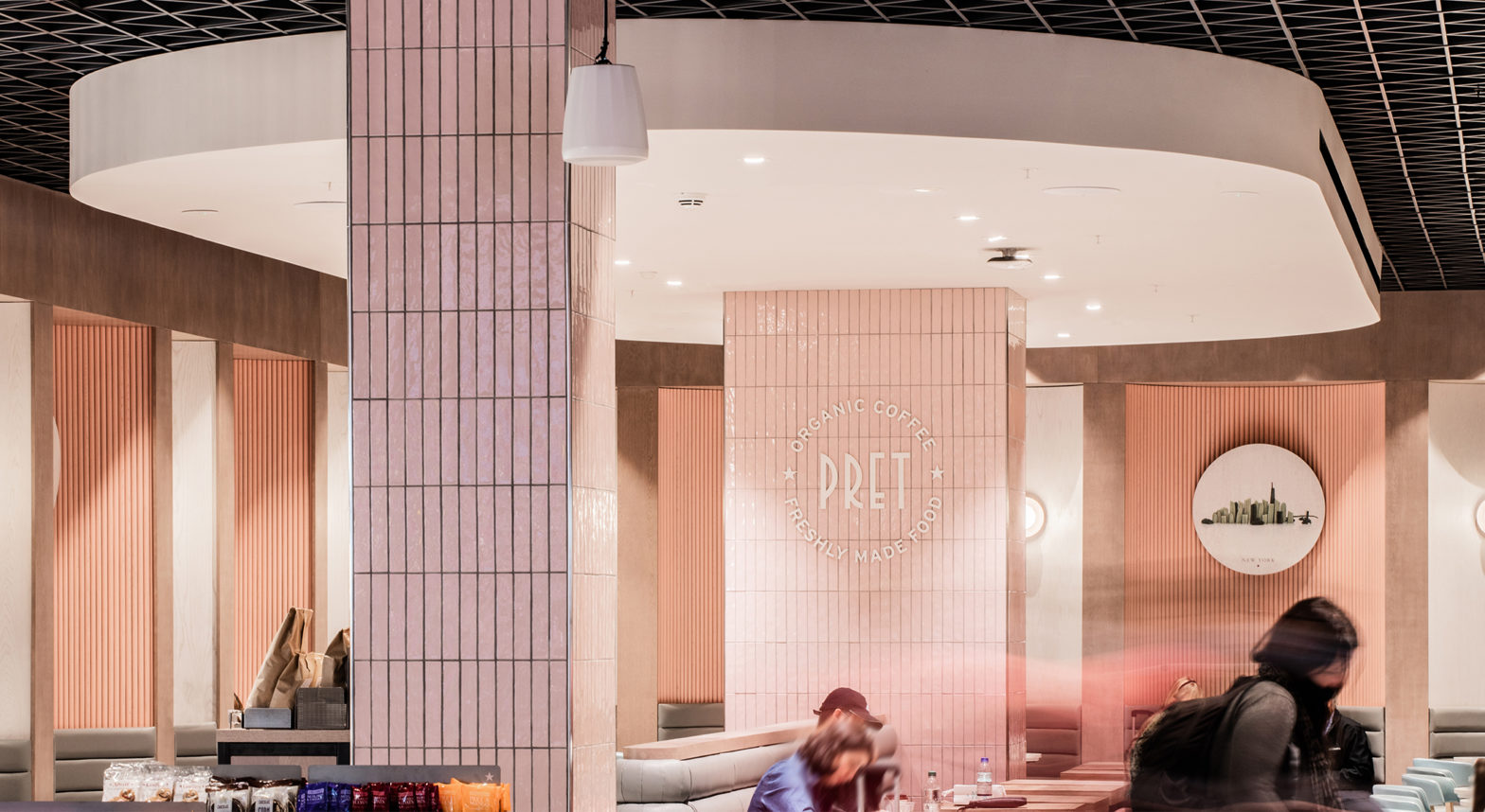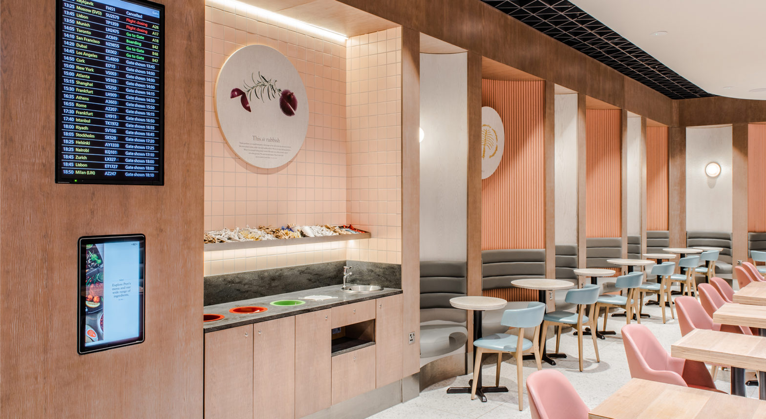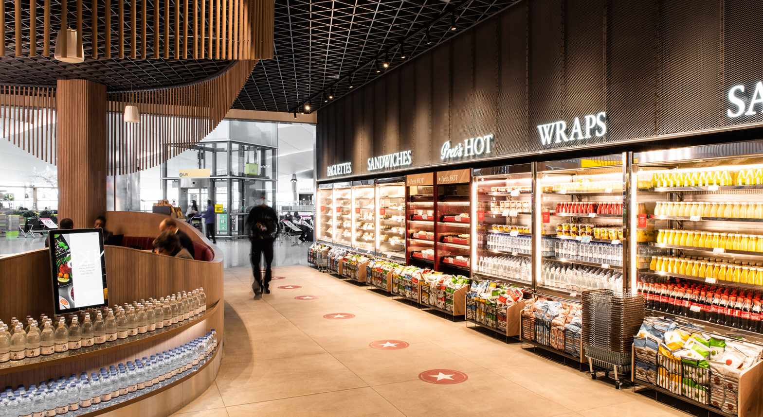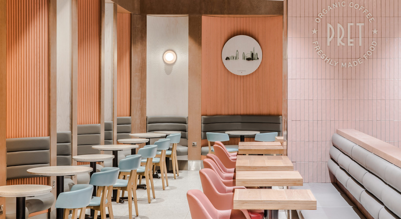
Designing Pret A Manger’s largest airside store at Heathrow Terminal 2, blending a unique flagship feel with the essence of the Pret global brand.
Resident were appointed to design Pret A Manger’s largest airside store to date at London Heathrow’s Terminal 2, one of the busiest airports in the world. Pret’s brief, combined with Heathrow’s retail design aspirations, called for a flagship store that would be uniquely identifiable to the terminal while still embracing key elements of the iconic Pret brand.
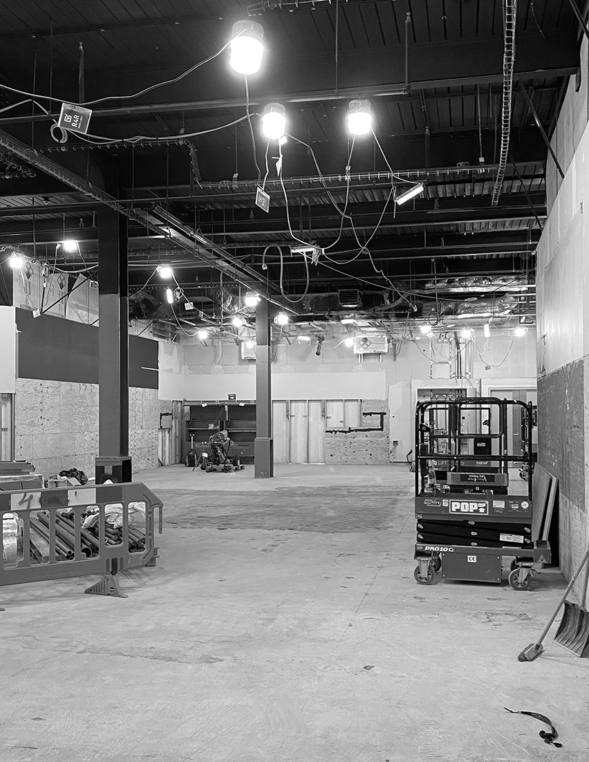
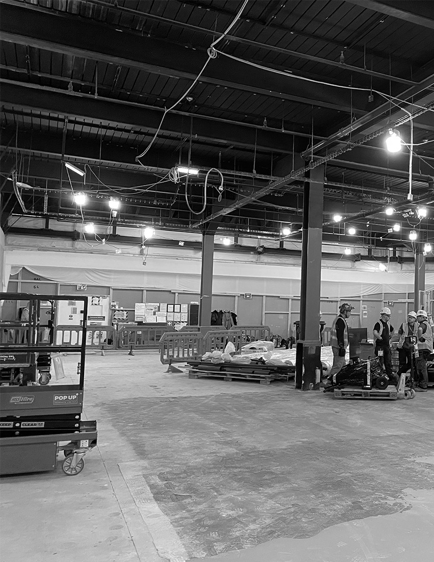
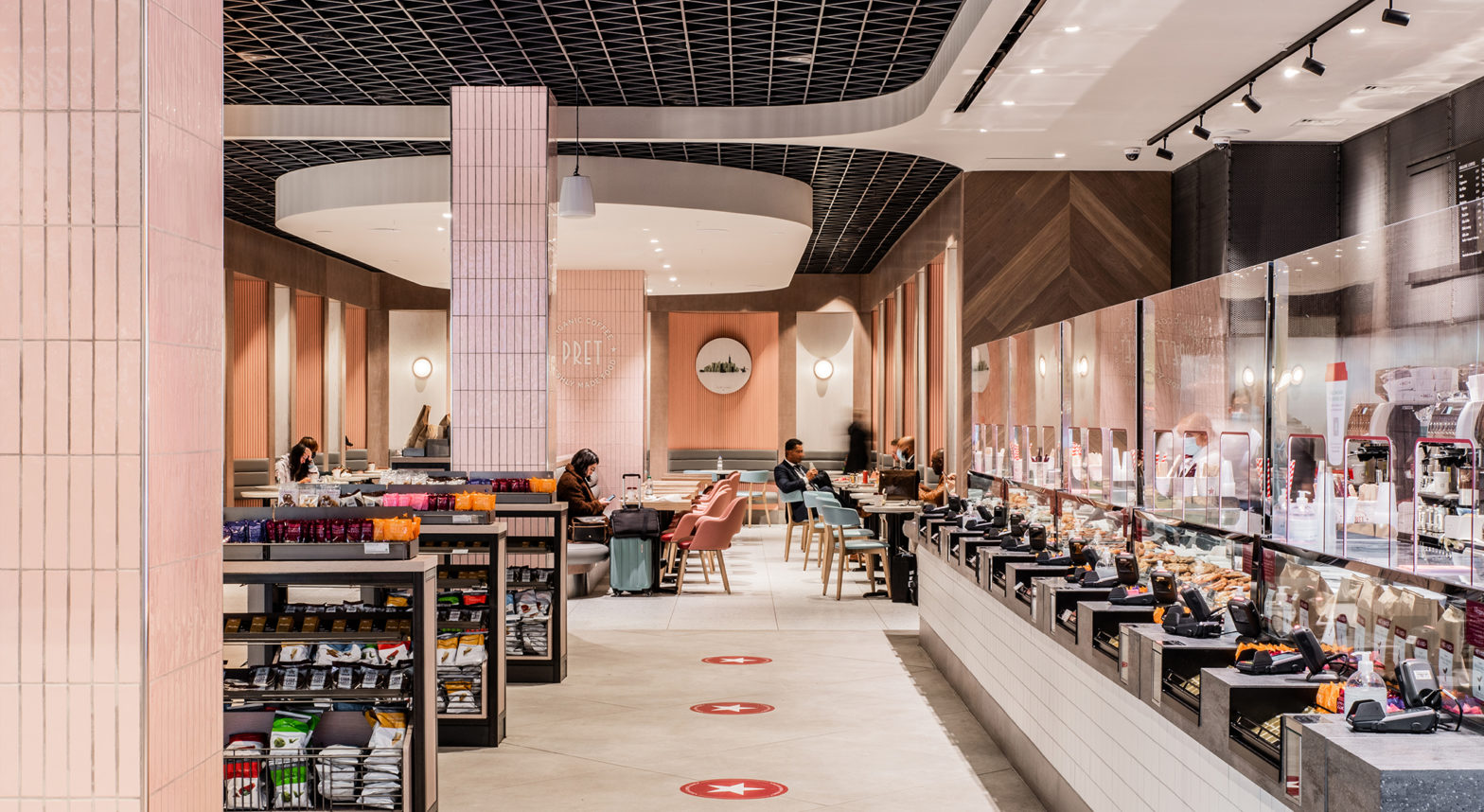
We transformed the original store layout from a closed and cluttered space into an inviting, spacious dining environment. By opening up the entire shopfront, we maximised sightlines and allowed for smooth customer flow during peak times, while ensuring flexibility for future adaptations.
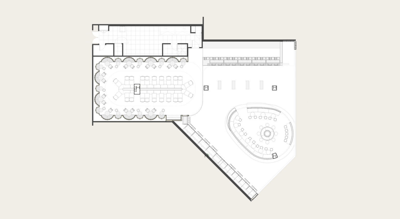
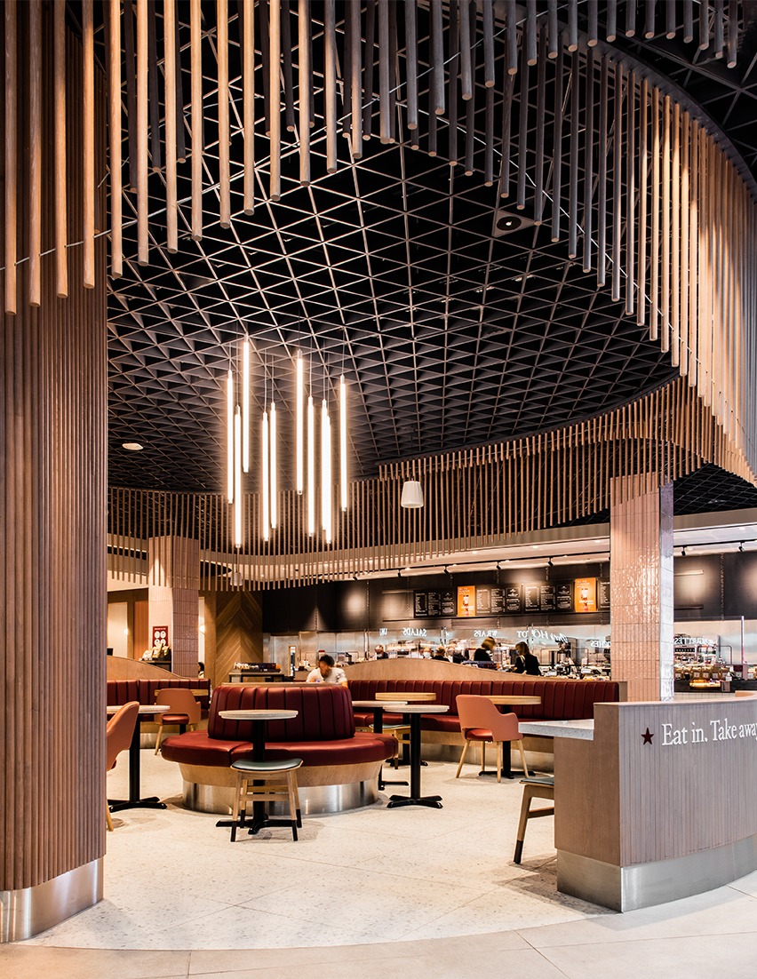
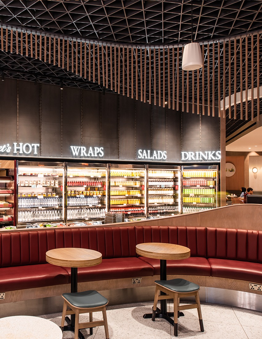
Key customer touchpoints like product pick-up and sales were relocated to the sides of the space, animating the central area with bespoke joinery that catches the eye and draws guests in. A sweeping seating feature guides intuitive customer movement, displays merchandise, and offers a quick seat for those on their way to boarding.
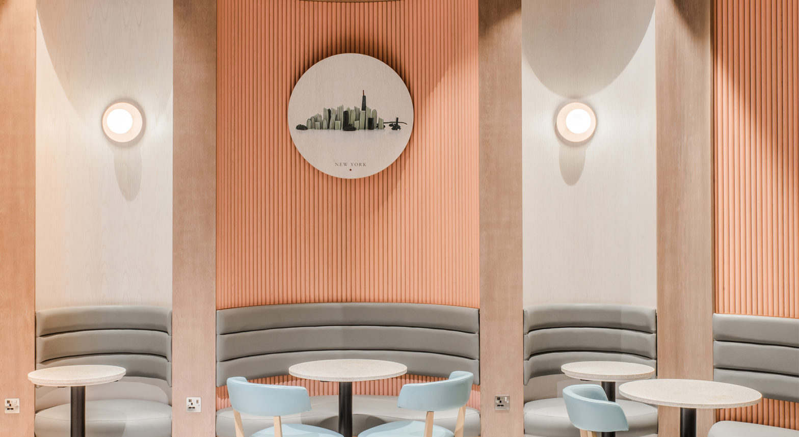
To create a more intimate atmosphere, we incorporated a dropped bulkhead towards the rear of the space, alongside curved banquettes in Pret’s refreshed pastel palette. These elements provide a touch of privacy for both individuals and groups looking for a quieter moment before their flight.
Get in touch.
